Tuesday, May 28, 2013

May Projects.....Good bye colors...

Wow, after looking at the photos of my projects I realized that it is all about the men in my life (except the purse).

I wanted to use retiring colors and papers for this month’s projects. I also knew what themes I wanted to showcase; Graduation, and Father’s Day along with using the Purse Die for both the Mother’s and Father’s Day theme.
 

Starting with the graduation card.

My youngest Conner, will be graduating from 8th grade this year. As it turns out his school colors are Burgundy, Black and White so I used the retiring Bravo Burgundy in this card. In addition to the black and white card stock, I added a bit of bling with the Silver Glitter Paper to accent behind the stamped graduation hat. The hat stamp and sentiment can be found in the Pure Gumption set, from the Spring Mini Catty.* Also used for this card is the Houndstooth Embossing Folder ~ ha, I thought this folder was new, but upon further research it is just new to me.
 

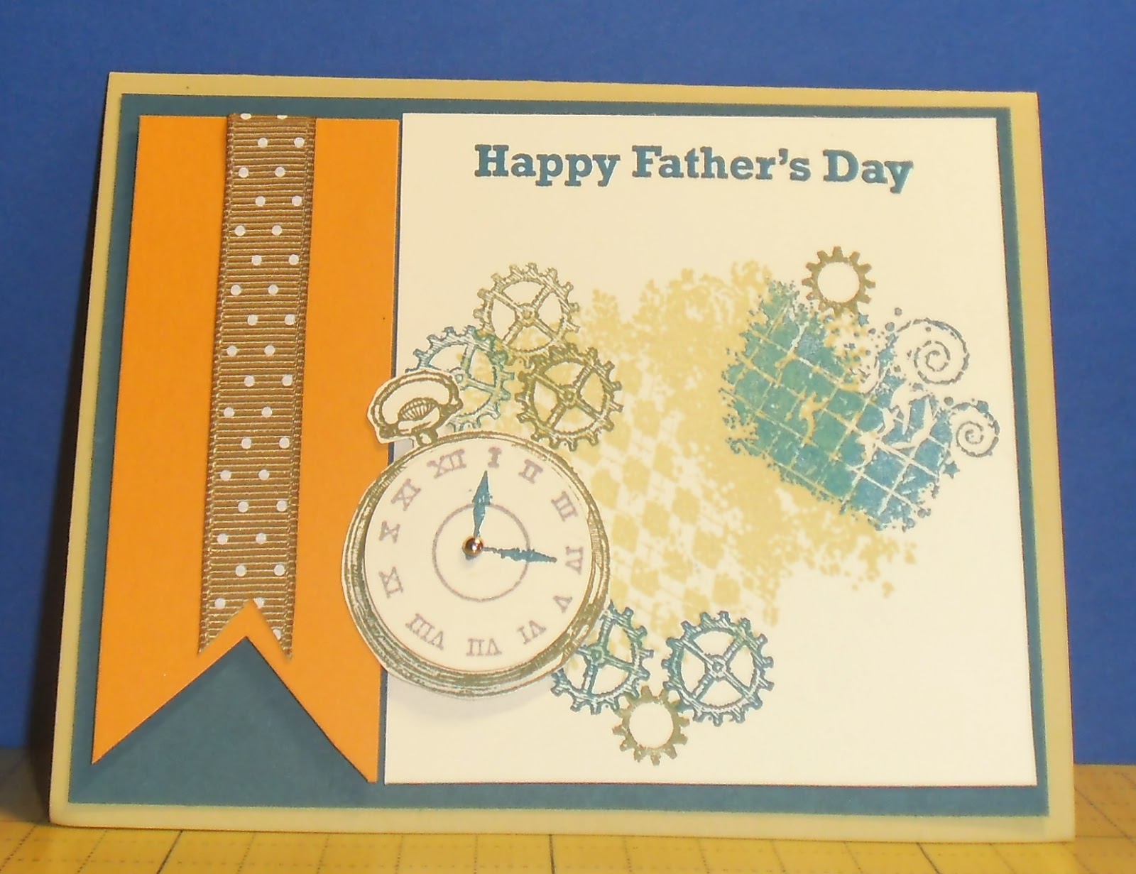
Next is the Father’s Day card.

This card uses the Clockworks* set (again, thought this was a new item but only new to me…). Of course the men in my life for this card are my father and husband. The main colors used for this card are all retired; Night of Navy, River Rock, and More Mustard. The latter two are two of my favorite colors that I will be sad to see go. In addition, I threw in some really old retired ribbon to add another layer of dimension.


Lastly, we did a 3-D project using the Big Shot Petite Purse Die.

I’ve had this die for a while, but for some reason never used it at my groups. For the ladies purse version, just in time for Mother’s Day, I used retiring DSP and corresponding ribbon. For the Father’s Day fishing creel, I used Crumb Cake card stock for the body. I then embossed it using the Square Lattice Folder, to give it a look of woveness (new word ??). The corners and handle are Chocolate Chip stock and then one of our Metallic Brads to look like a clasp. The fishing pole is a wooden skewer cut down to size and the line is Early Espresso Baker’s Twine from the Holiday Mini Catty. So, are you wondering what set the fish are from? It is C for Cat. Yes, this is an old-old set, but I couldn’t part with it, nor the D is for Dog set, hehehe.

Thanks for stopping by, see ya next month.

*Spoiler alert – these sets will be carried over to the Annual Catalog

Monday, April 29, 2013

Easter Scrappin' Pages


Easter for me is a time to get together with family, annual egg hunt, food, and of course the religious aspect of the holiday. So, I wanted to do a couple of pages that would fulfill all of those feelings.  

The first two pages have the feeling of the hunt with the basket, eggs, and flowers all made with punches and dies. The basket was made from weaving strips of Crumb Cake cardstock, cutting them out with the Top Note die, and then two Oval Framelits for the handle. 


For the eggs, I used miscellaneous colored card stock. I ran them through the Big Shot with various embossing folders; Polka Dot, Elegant Bouquet, Vintage Wallpaper, Chevron, and Adorning Accents to get the texture, and then punched them out with the Large and Extra-Large Oval punches. The funniest thing about these eggs was seeing Sally have so much fun picking through the various eggs, it was a delight.  

The flower was made by punching out petals with the Large Oval punch. The top is the 1-3/4 Scallop Circle punch then cut in half and the stem is from the Secret Garden Framelit. Both the petals and top of the flower were sponged to achieve the shadowing effect before layering together.

At the bottom of the page is grass. Okay, it would be so much easier to have a punch for grass, but the technique is really simple. I cut 1 & 1/2” strips of green stock and then cut the strips with my snips varying my angle and depth of the cuts.

The letters were cut out with the Big Shot Alphabet set. The cardstock used for these pages were Daffodil Delight as the base, Concord Crush, Wisteria Wonder, and Regal Rose for the additional layers.  

*****************
 

For the next two pages, I wanted to complete a more sophisticated religious look. The base card stock used for these pages was Bashful Blue. Rose Red, Pink Pirouette, and Crumb Cake were used for the accent pieces. The coordinating DSP used was Twitterpated. This was one of my favorite DSP from the Annual Catalog and I will miss it.


The accent pieces were cut using the Label Collection Framelits. The stamp used was Easter Blessing, a single stamp available in the mini catty. It was stamped with Rose Red on Bashful Blue and cut out with the Framelits then layered on the DSP. Extras used on these pages were In Color Dahlias, Pretty in Pink ½” Scallop Dots Ribbon, and a bit of Cherry Cobbler ½” Seam Binding Ribbon.
Sad note: SU! is saying goodbye to Bashful Blue in the latest Color Refresh.

Thanks for stopping by, see you next time.

Sunday, April 28, 2013

April Mojo Monday Projects


How does the old saying go; “April Showers bring May flowers”? Well, not so much of April showers, but we did do flowers for my April Mojo Monday groups.

SU released in the Spring Mini Catalog a new stamp bundle Secret Garden. It comes with beautiful flowers stamps and coordinating Framelit dies. We used the set for two cards along with embossing powder and a different “painting” technique for one of them.

For the first card Bloomin’ Marvelous, we layered Baja Breeze, Early Espresso, White, Pretty in Pink, and a touch of Old Olive cardstock. I just love the blue, pink, and chocolate color combo. The flower is embossed with Early Espresso embossing powder on the pink. The Baja is embossed using the new Fancy Fan embossing folder. It reminds me of lattice work in a garden with the flower on top. The stamped sentiment was from this year’s SAB collection called Bloomin’ Marvelous, ha! Extras used on this card were the Bitty Butterfly punch and Early Espresso ¼” Stitched Grosgrain Ribbon.  


Sad note: SU! is saying goodbye to Baja Breeze and Pretty in Pink in their Colors Refresh in the new Annual Catalog – more about the Color Refresh to come later.

The Happy Mother’s Day card also uses the Secret Garden bundle and White embossing powder, but that was just the first technique done to this card. After the embossing, we painted with an Aqua Painter layers of colors on the flowers. We started with White, then Regal Rose (another “lost” to the Color Refresh) and finally for the pop of color we accented with Rich Razzleberry. The card stock used was Pear Pizzazz, Regal Rose, and White. The DSP used was Sunshine & Sprinkles from the mini catty. The stamped sentiment is from Teeny Tiny Wishes and then punched out using the Word Window punch. We then layered it on top of more Pear Pizzazz stock using the Modern Label punch. The final touch was a bit of Whisper White Organza Ribbon to finish it off.


Good note: In-Color Pear Pizzazz has migrated into the new Annual Catalog as part of the Color Refresh. It’s such a fun green color I’m glad it is staying.

The last card uses a new stamp set By the Tides from the mini catty. I embossed the Coral stamp image with Pool Party embossing powder. I liked the texture it gave to the card. The card stock used was Crumb Cake, Early Espresso Core’dinations, Marina Mist, and white. Embellishments used were the Honeycomb embossing folder on the Core’dinations stock, with light sanding using the sanding block, old retired SU twine (sorry, I still have some of this around and thought it was perfect for the card), the ½’ circle punch, and some Dazzling Details over the coral, shell and sea horse for a little bit of bling.


I can see using this set for some summer time beach scrapbooking pages, so look for those to come.
Thanks for stopping by, see you next time.

Sunday, March 24, 2013

Mojo Monday – Ode to SAB


Being this was the last month for Sale-A-Bration (SAB), I thought it was best to complete some cards that use the SAB stamp sets, DSP and the Ribbon & Button combo packs.
The first card is a fun one that uses the Patterned Occasions stamp set. I chose to use the “Blue Jeans -Congratulations Smarty Pants” in that stamp set. To get a blue jeans effect, we used the Night of Navy Marker instead of the stamp pad.   This way it doesn’t get a uniformed stamp image, but more of a washed denim look.  For the sentiment underneath, I used the Pumpkin Pie marker. Once you color your stamp with the marker, remember to “huff” before stamping.


The coordinating layers of card stock are; first, the DSP is Sycamore Street (also from SAB) then I layered it on Pumpkin Pie card stock, and the base card stock is Night of Navy.  The added embellishments are; Denim Jean Ribbon (okay, how perfect is that) and, more SAB product, the Sycamore Street ribbon and buttons pack.


For the second card, I used the Feeling Sentimental stamp set from SAB.  One of my Mojo Monday “gals” is from England and she ‘inspired’ me to use the Telephone booth (I think they call it the “Telly”) for this card. I knew I wanted the Telly to be in red.   So, I stamped it in Cherry Cobbler and then embossed it with clear embossing powder. Yes, with SU’s new foam ink pads being so moist, you can emboss from the stamped image  instead of having so many different colors of embossing powder.  It really lets you customise your projects.  The Oh, HELLO stamp image is from the stamp set of the same name, “Oh, Hello”, in the Spring Mini Catalog.  All the images were stamped on Vanilla card stock, layered on Cherry Cobbler, then Basic Black for the base card stock. The additional DSP is First Edition Specialty and the last embellishment is tiny Silver brads.  A clean and simple card if you need to drop someone a line.


Lastly, I did a quick Easter Card that used the Everybunny stamp set in the Annual Catalog.  In addition, the pennant and chevron stamped images are from the Oh, Hello stamp set and then cut out.  The various oval shapes were cut out from the new Ovals Collection of the Framelits Die.  If you look real close you can see the Needlepoint Embossed image on the bottom Pink Pirouette piece at the bottom of the card.  The colors used for this card are Pink Pirouette, Pretty in Pink, So Saffron, and Certainly Celery.   
Thank you for stopping by and I hope everyone has a “Hoppy” Easter!

Wednesday, March 13, 2013

Marching into Spring!


At the beginning of the year, my upline, Janice, and I decided to co-host the Saturday Scrappers group.  This was her month to lead the group and we completed fun, spring-inspired pages.
The first 2-page spread is so bright and colorful!  We used Daffodil Delight for the background paper and then layered flowers and butterflies out of Floral District, Summer Smooches and Polka Dot Parade DSP.  In order to cut and punch out these items, we used various punches; both sizes of the Scallop Circle, the Blossom and Boho Blossom, the new Elegant and Bitty Butterfly, and the Floral Frame Framelits.  It was fun picking out our own color combinations.  I was again drawn to the purples and Rich Razzleberry (I still need to let you in on my girlie girl purple inspiration – coming soon – I promise).  Others in the group chose more of the orange and yellows in the above mentioned DSP.  They were all beautiful pages.


The next 2-page spread had a fun Poppies feeling (hello, its California’s state flower).  We also used one sheet of the Floral District DSP sheet with the printed Poppies on it.  Are you wondering what embellishment is used for the accent Poppy?  Well, we made that flower ourselves.  Yes, a handmade embellishment by twisting, turning and wrapping the Tangerine Tango ribbon from the Sycamore Street ribbon and button’s collection in the Sale-a-Bration catalog.           
“Sale-a-Bration” – a great way to get FREE items from Stampin’ Up!

I think these pages are so fresh and they put a spring in my step to get started on next month’s pages.

As always, thanks for stopping by.

Tuesday, March 12, 2013

"Love" for Saturday Scrappers

For February, we completed five pages that had a romantic theme to them.  Starting off, the first two pages didn’t scream romance, but could be used for a basic layout.  They are well suited for a new, budding love affair.


The next two pages started to bring in the romance with hearts and by stamping the word “love”.


Throughout all the pages, you see the frame stamp used from the Papaya Collage stamp set along with the flowers in Everything Eleanor and the beautiful accents from Elements of Style stamp sets.  The four pages use the Tea for Two DSP stock and the base paper Crumb Cake, Basic Grey.  The coordinating paper stock used was Vanilla, Primrose Petal with a splash of Bashful Blue.

The last page really brings out the LOVE…Romance…and the Girlie Girl in me… (more to come on that in a later post).

For the last page, I used Vanilla for the background paper and then layered it with Pretty in Pink and Regal Rose. The accent embellishments used for this page are from the Spring Mini Catalog.  They are the Artisan Embellishment Kit (Love tag, scalloped lace, cotton lace, paper flowers, resin heart, buttons, and paper doily) and the 5/8” Flower Trim.  The Hearts are from the More Amore DSP and the large Hearts Collection Framelits.  Oh, don’t forget the pearls and using the Scallop Trim Border punch.  I also added the bird cages from the Aviary stamp set to add just a little bit more fun. This page, I believe, is true romantic love! 
Thanks for stopping by and I hope you find "love" in your heart!

Sunday, March 3, 2013

Showers of Love


February, a month dedicated to LOVE, Presidents and usually a lot of rain. Well, I think I had all of that and more, I had Love; enjoyed a great evening out – went to a movie and dinner with just my husband. Yes, we left the boys at home and I saw a movie that was not a shoot them up, blow them up and involving racing cars. No, I take that back, the movie we saw had all that and more, Identity Thief. But it was oh so funny and again it was just my sweetie and I.

For my projects this month, I included a bit of love, rain but not so much of the Presidents; unless you want to count the bird in a birthday hat….and really don’t we only celebrate the President’s birthdays anyway?
 
For the first cards, I used the new Cloudy Day Embossing folders, the Rain or Shine stamp set and the Sunshine & Sprinkles DSP all from the Spring Mini Catalog. I wanted to keep the cards clean and simple, so I used white stock for the clouds and coordinating Marina Mist, Melon Mambo, and Daffodil Delight for card stock and ink.
Additional embellishments used were Marina Mist 3/8” Striped Organdy Ribbon, and Lucky Limeade 3/8” Ruffled Ribbon.


For the first of the second set of cards (remember President’s Day) we used the Papaya Collage stamp set from the Annual catalog.  We did a fun, more masculine birthday card, using Bright White, Cherry Cobbler, Old Olive, Daffodil Delight and Basic Black for the color scheme. The red striped ribbon is a retired ribbon (so sad to see that ribbon go) and additional we used the Itty Bitty Banners stamp set and the coordination Bitty Banner Framelits Die for the sentiment.
The second card still using the Papaya Collage set, but this time with a much more romantic, feminine style card. Colors used were Baja Breeze, Crumb Cake, Vanilla, Rose Red, and Soft Suede. Embellishments on this card are Soft Suede 3/8” Taffeta Ribbon, Designer Frames embossing folders (the picture frame that the bird is posed within) the Decorative Label punch (one of my favorites), the ½” and 3/4” Circle punches, the Bitty Butterfly punch and then adorning a couple of pearls.   

I hope your month was filled with Showers of Love! Thanks for stopping by.